

When it comes to album art, it's safe to say nu metal has a mixed track record. Sure, you’ve got undeniable triumphs, such as Linkin Park’s Hybrid Theory, where the juxtaposition of the soldier and their dragonfly wings not only led to a plethora of tattoo requests but also symbolized the band’s fusion of contrasting musical elements and emotions, or Omerta's Hyperviolence, where the Korn-eque childlike drawing featuring a rainbow at the top somehow manages to encapsulate some of the most cathartic and chaotic expressions of hatred the genre has to offer.
Heck, even minimalism--an art movement far removed from what puts the “nu” in nu metal--has resulted in a couple of winners. Be honest; when was the last time you saw someone take shots at the art direction of White Pony or System Of A Down?
And then there’s this. Keep in mind that multiple parties over at Pavement Entertainment must’ve greenlit this artwork before the album hit the shelves. It is, in a way, reminiscent of the cover art for Weathered by Creed, which Rolling Stone recently placed at the #3 spot on their new 50 Worst Album Covers of All Time list, describing it as having "semi-competent Photoshop fakery of the band’s faces being digitally carved into a digital tree". Seeing as Trick Daddy’s www.thug.com also made the list, it’s safe to assume Rolling Stone just isn’t Pen & Pixel pilled. By 2013, however, Photoshop had already come a long way since the two aforementioned albums, making Topple the Giants a truly spectacular sight to behold.
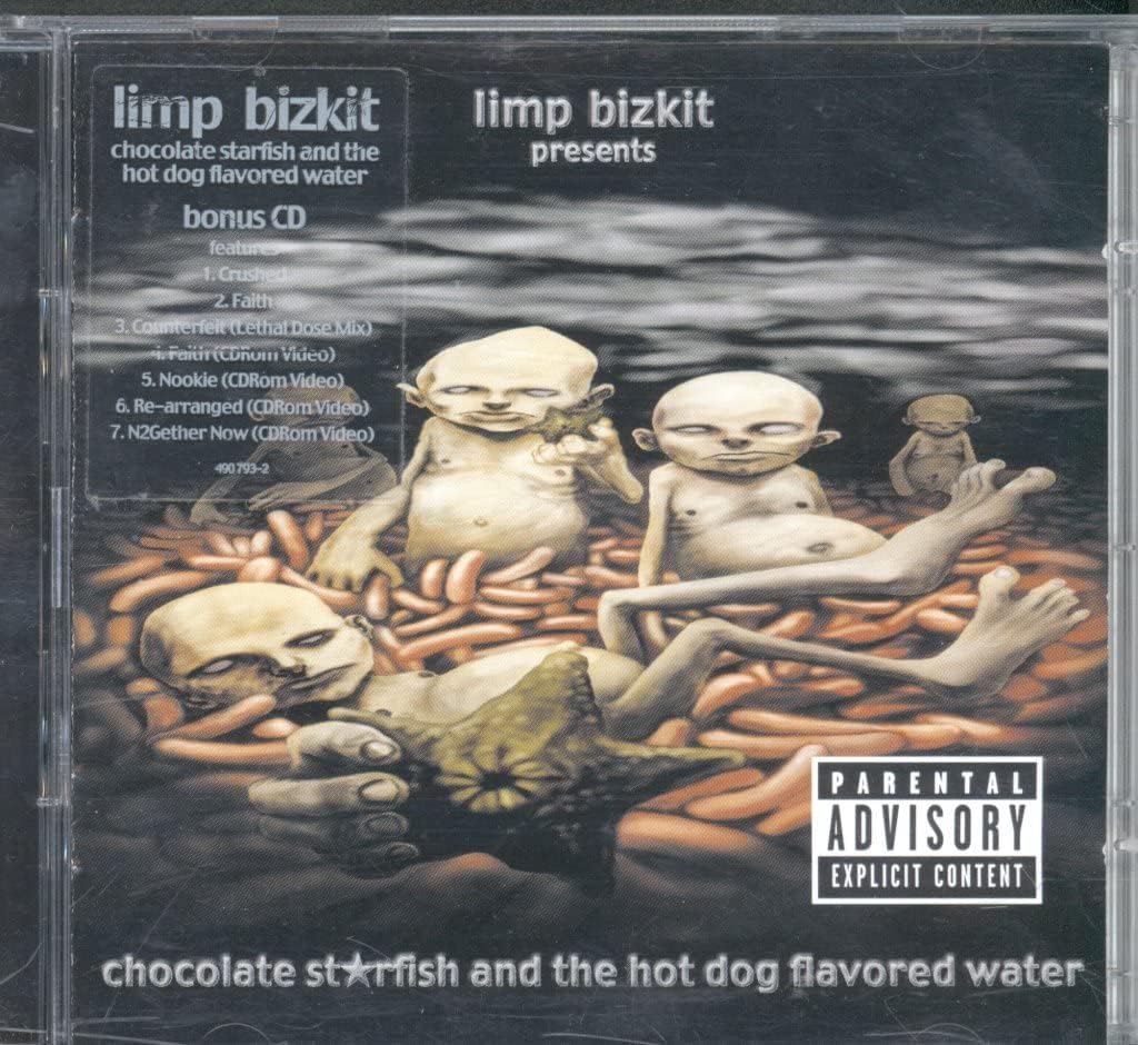
Even so, Adema's whack-ass efforts were nothing compared to one of the fastest selling-albums of all time, Chocolate Starfish and the Hot Dog Flavored Water by Limp Bizkit. Entering at #1 on the worst album covers list, “Five Gollum-looking dudes lolling around on a bed of nitrate-infused meat?" according to Rolling Stone, is a "fair representation of Limp Bizkit”.
While they admit the artwork, which guitarist Wes Borland was responsible for, really captures the image of the Bizkit, they forget to mention one crucial detail: the lack of irises and pupils in the eyes of these Gollum-looking dudes. Those who own a copy of Starfish on CD will notice the same lack of eye parts on the floating heads of the band members on the front side of the spine. The fact that it has since become a staple of the nu metal aesthetic not only underlines Borland’s artistic genius, but should serve as a stark reminder to Rolling Stone that when it comes to nu metal, it's (our) way or the highway.


